We have all witnessed signs along streets/roads that warn us of various hazards. Truth be told, we usually react negatively to the sight of such signs in the distance, for we know that some danger/inconvenience awaits us. The choice of orange for these signs follows from the fact that it is so ‘eye-catching’ [really no need to explain that to OYGIF folks].

Welcome/Willkommen!
Hello and welcome. Hope you enjoy the images I have posted. Please do not reproduce them without my permission. Most are available as note/greeting cards or as prints/enlargements. Thank you for visiting my site and your comments.
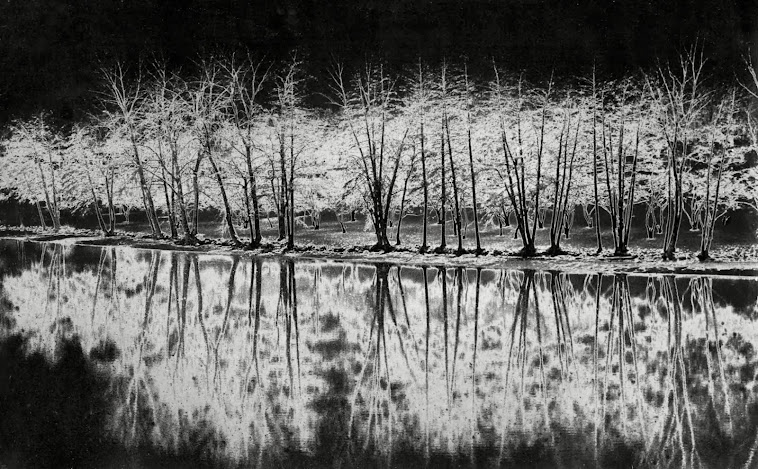
Many have asked about the Header image above, which I named 'Eerie Genny'. It was originally shot with film [taken on the shore of the Genesee River near the Univ. of Rochester]. During the darkroom development, I flashed a light above the tray. The process, known as 'solarization', produces eerie, ghostlike effects; some have mistaken this image as an infra-red photo. Some 35+ years later, I scanned and digitized the print, and did a little modern day editing, and, voila.
« I confirm the subscription of this blog to the Paperblog service under the username shattman ».
Subscribe to:
Post Comments (Atom)


No comments:
Post a Comment